Sunday, 5 January 2014
Project Evaluation Unit 2
My self project on human form and expression was an exciting and challenging journey, I focused on human health, something i am familiar with in terms of fitness and diet. The original focus was to convey fitness and health in a manner of branding , it was suggested by my tutor to explore, I guess because it was out of my comfort zone and is a good body of work for my portfolio which I agree with but for this unit I decided to look at a health awareness campaign surrounding food. I titled the project Lifestyle Or Deathstyle a juxtaposition between the foods we choose to eat which in turn affect our mental state, physical body and life longevity.
This work is an offspring of a personal project I developed a few years ago it based around the same subject matter, it started due to a conscious awakening which made me aware of what I ate and the affects certain food had on my body and mind.
My work was mainly influenced by illustration, graphics and 1980's typography. Illustrator Patrick Nagel was my first study, his work is bold, clean, minimal and is a good example of poster design. My look at 1980's typography was quite a dig I viewed many old VHS tape covers, magazines, blogs and modern reincarnations.
Before I came to the decision to use graphics I had created various textile samples with my tutor Donna, she taught us a technique called reverse applique which I used to make font but I felt it didn't fit my project.
The process of creating my own font was satisfying, I found two style commonly used in 80's typo, brush calligraphy and bold font. The brush influence came from a movie named Drive, the design aesthetic is what moved me to using this style.The bold font in part come from a movie called MegaForce, I took influence for its headline element and letter manipulation, the other was artists Rodchenko and Popova their shapes and colour schemes took to my eye. I used various pens, pencils and measurement to build my font samples, once I had the rough drafts i scanned them to computer where i fine tuned my work. Creating my font on illustrator has endless possibilities, I created custom brushes, shapes and colour palates which resulted in a great outcome of graphics work.
One of the foundations to creating my work was understanding body dynamics a very important study for any artist, I found shapes a very good guide to understanding the body and have made this evident in my sketchbook. The key focus is looking at communication and expression in art and what better way to do this than to study artists who express this. Patrick Nagel is an example of this, his illustrations of the female form showcase expression in their posture and communication in their style and look. Nagels work was produced in the 1980's a pinnacle of female empowerment and his illustrations showed that.
Schiele and Mucha also lent great knowledge on understanding the human form. Schiele's work to me is like a blueprint of the human form, he was not completely accurate in his paintings but made light of the shapes that the human body encompasses. In my opinion Mucha's work was elegant and accurate in how he depicted the female form, details such as the hands and face struck me in Muchas Work and i definitely took some tips while doing my sketch study.
Considering the various sketches that I have done my final work is minimal in movement but still projects life, that's not to say i wont explore more movement in future projects. My Lifestyle poster focuses on facial expression, the character smiles arms stretched out as to convey the message of embracing good health and life. The deathstyle poster blatantly projects bad health, the character is static with cigarette in hand which communicates the junk that we fill our bodies with, also the smoke blending into her hair is a reference to mood.
Colours are a very important element in art, they communicate a mood, place, culture and many other things. I looked to achieve a very minimal palate with my project, I did add more colours than planned. Harmony and simplicity was something I learned looking at artists and their palates. I experimented with acrylics, pencils, markers and paint pens mixing and matching various colours figuring what worked and what didn't, the palate I used for my finals definitely reflected the imagery and message.
I chose to work with layers for my final project, Stephanie Dotson was my study for this chosen medium as she utilizes layers into her work. Materials i looked to use were acetate, textile, trace paper and graphics, I had not explored any other layer variations at the time so feel that i need to extend my research on that. The materials that formed my work consisted of laminate sheets, in between them I placed canvas paper painted with acrylic, a printed graphics border, images drawn to acetate with a high quality permanent marker, sugar paper and clear sticker paper.
Giving my work an element of life was something I had explained earlier on in my writing's, I took to Alphonse Mucha for this study as he was famous for his theatrical poster paintings. Besides the elegant flowing females in his art Mucha created amazing borders for his work which gave his 2D painting an almost 3D element. I tried to figure a way in which I could achieve this but was not successful in my practice, I used layers of acetate to build my work up. Included in my layers were a border and an image of my Lifestyle character whose arms were supposed to extend outside of the borders but due to some mishaps and short time the arms had to stay in. I think graphics and print would have been a good choices to achieve this and will definitely experiment with these mediums in the future.
I mentioned Stephanie Dotson earlier on in my work and how she influenced my use of layers, she also led me to experiment with some of her processes. Dotson is a mixed media artist, her work spans from painting, drawing, installation and printing, she inspired me to try a technique she used in her work called impasto in which you use a thick layer of paint to create texture. I tried the impasto technique using acrylic paint not necessarily looking for a thick texture but instead creating patterns where I applied a continuous brush stroke, i used this technique on various materials such as fabriano, canvas paper and acetate. I used this discovered technique on my final awareness posters, it was painted to acetate which I thought would show well beneath various layers but the patterns were not very clear in the end. Another lesson is to be learned in my study and that is to apply extensive experimentation to each technique used.
The background designs for my work were very minimal as not to take anything away from the rest, I did this from simple research. The Reebok flash store in NewYork had some say in my choice of design, in 2008 their store was designed with colourful geometric shapes which was inspired by vorticsim an early 20th century English arts movement which was partly inspired by cubism. I created many samples on foamboard and canvas paper using spraypaint, brusho, acrylic and printing paint. I made a decision and used acrylic on canvas paper which turned out good but when coupling all of my layers and finishing my finals I found the background was slightly hidden amongst the other layers. To solve this I could scale down the layers above or amend the background so that it stands out more, i have done a graphics versions of my backgrounds which i definatley will make use of.
whilst prepping my layers I did get some insight on various poster styles and layouts. The mental illness campaign stood out for me, it's subject matter, simplicity, installation and font placement was in some way what I aimed for.
Through my project I have learned that the ideal vision or sketch that you have of your final piece does not always suffice as I learned with one piece. I explained earlier that my work is layer based and that I am using laminate to compress my layers. So I prep and head to staples to get my work laminated, but there's a problem it hasn't sealed properly plus a few layers have moved inside, my only guess is that first layer caused this as it was textured canvas it left air pockets. I didn't let this bother me as there are alternatives to this problem such using a flatter surface or using graphics.
I grew on the idea of laminating to much which made me loose sight of other alternatives processes but all in all I am happy with the outcome of my finals, I only learn from this and and I look forward to the next unit.

Sunday, 15 December 2013
Foundation London Trip
My two day trip to London was very insightful and informative; I viewed various art galleries and Chelsea University while travelling. My tutor has set me and my class the task of producing a personal project based on expression and communication, I will be looking at health and fitness which relates to this very much.
Day one
The first visit was made to the national portrait gallery showcasing many free and elegant paintings, artists such as Egon Schiele and Broncia Koller were featured.
Egon Schiele took to my eye, raised bare shoulder the title of one of schieles painting shown at the gallery, and the title explains his focus on this painting, the human form. To me his work shows freedom and experimentation, something I will apply to my project.
Schiele was an Austrian figurative painter who created an abundance of work of self portraits and models, the way he expressed the human form was not of the typical type and the paintings were twisted with a slight disposition. Also the models in the paintings and Schiele were very casual and natural; formality does not exist in his work.
While at the national portrait gallery I took a few notes regarding techniques used to build the human body. A few paintings were done where the artist painted the outside of the figure to build its form E.G torso, arms and legs were left as white canvas, a very interesting method.
After the national gallery we moved to another exhibition which focused mainly on photography, there was some great work displayed and many examples of expression and communication, i made use of this by comprising various sketches looking at various poses, shapes and body type.
Hana Knizovas photograph of twins elza and nellie was clean work, the models were natural beauties, had tall slender figures and an attitude. The body language said a lot is why i did an illustration of her work. Knizova is a photographer living and working in London and has showcased many exhibitions of her work, looking through her portfolio she seems to focus on people in their environment, how they live, what they wear, their sexuality, and their comforts and so on.
As a people we express and communicate everyday and in different varied levels, to capture that through photography is intriguing, even more so sketching that moment in time to a piece of paper.
Day 2
The second day was very busy the first visit was to the University of the Arts, which we were informed on the prospects of joining. My class and I were given a tour around the University showcasing the facilities that we would have access to if we were successful in a place there, I will say the tour guide was pretty convincing. The university has a lot going for it such as paid internships, spacious studios, workshops and links with organizations offering experience by having you partake in live projects. I am looking to study a BA Hon in illustration which the UAL offered at Camberwell College of arts, I would be quite pleased if I secured a place at this university.
Moving from the University I visited the saatchi gallery which was great in the diversity of work and offered a lot that tied into my work.
Eddie Martinez work was interesting in the fact that he used a mixed media such as oil painting, spray paint and collage, the freedom in his work is to be respected, personally it was not to my liking because proportion and line work were not perfect but that’s the whole point of his work I guess.
Though im not a fan of the mark making techniques of Martinez he does have an interesting message in his work, his work titled The Feast was a large canvas piece with a diversity of characters, a large table and food mixed in with random inedible items, does it symbolize social class? Or greed and indulgence? This interests me as my project is based around health and fitness in which I will explore food.
Helen Verhoven work was morbid but some contained vibrant colours , this was appealing as it shows she doesn't always conform to colours relative to the subject matter. The message in her work is not clear there seems to be symbolism and statements thrown about the many figures and objects in the painting, leaving you with mixed interpretations.
Many others artists that can influence my project were on display at saatchi such as Jason Stegnar whose paintings are an example of over exaggerating the human form with smooth dynamics and stegnar makes it work.
The final stop for the trip was Victoria and Albert Museum the first gallery viewing was club catwalk which looked at the amazing trends and designers of the 80s, there was a great pool of ideas to feed my project. Katherine Hamnett appealed to me alot and i have taken a few steps to developing ideas based of her designs.
She held certain political interests and awareness such as the "58% dont want Pershing" garments which were inspired by the Greenham Common anti- missile protests.This raising of awareness by Hamnett is exactly what I need to incorporate into my project, those bold black letters she uses on stark white garments need to be applied to my illustrative work in my own words of awareness. As simple as her design looks it says a lot about communication and I feel this can be one of the defining factors in building my work. The array of pattern and shape shown at club catwalk was inspiring giving me ideas in building the layering and background elements to my work.
The remainder of Victoria and Albert was very exciting, I spent a large portion of my time admiring the large scale and intricate rugs of the Middle East to the fine flowing calligraphy of China. I was mesmerized by the Japanese art and design i loved the materials and complexity of the katana sword, the fine embroidery and streamline design of the kimonos and the strong well preserved Armour of the samurai, i composed a few sketches of the items that took my eye the most and may extend this into future works.
The trip to london was tiring but enjoyable, i attained a great variation of influences for my project and i had a great social interaction with my classmates and tutors I look forward to future College trips.


National Museum Of Wales
The national museum of wales is the second exhibition that I have attended with my college.There was a lot to see at the museum but the main focus was to study two artist that fell in conjunction with human form and identity, Keith Vaughn and Howard Hodgkin.Howard hodgkin is a passionate collector of Indian paintings which did lend good insight into the people, culture and customs.
I am focusing on Vaughans work for this piece of writing as it speaks more in the range of my studies.
Keith Vaughan was an English painter and writer, he had great diversity having his hand in printmaking, drawing and photography. Some of the work I viewed of Vaughans holds testament to his mixed skill set. Each area was identifiable based of the imagery and what it communicated to me, I am learning this as an artist.
When Vaughan made entrance into the art world he was part of the neo romanticism movement which took place in WW2, his paintings were generally landscape pieces.
Vaughan later abandoned neo romanticism to focus more on the male form and becoming more abstract.
I can give an example of this transition by looking at the barrack room in 1942 and the blue boy in 1949.
The barrack room I see as a more traditional approach to vaughans choice of medium which looks like water colour and the setting lends itself to the time he spent with st johns ambulance and his living quarters. The blue boy is less obvious in terms of the setting as the male is the focal point and the colour speaks a sense of emotion though the blue to me doesn't reflect sadness but more a moment of suspended thought, you can see Vaughans abstract influence which is carried by lithograph. As an experimenting student lithograph isnt something I have tried yet and am open to trying when presented.
My view on Vaughns work is a mixed one, though he had great and varied skill in what he did and I can't help but feel slight discomfort by a majority of his work, "communication of hate" being an example of one, also the selection of colour and setting is not of my taste.
Dont get me wrong all of his work doesn't speak to me this way,his gallery work such as "lovers in a garden" and "standing figure" shined through in its medium and concept.
Looking into Vaughns history i can understand why his work holds dark undertones, it is said serving in st johns ambulance affected vaughan as he would often see dead or wounded soldiers. I learned that he documented written work and drawings in a journal about the insecurity of his work and and his homosexuality which also troubled him.
For a man who had gained wide recognition in the art world you'd think Vaughan was a happy balanced individual but with success doesn't always come happiness, i commend his efforts to achieve his goals through his troubled times may he rest in piece.
Visiting the museum and doing my research on in a way helps me to better understand the fundamentals needed to achieve ones goals through diversity and perseverance.
Saturday, 5 October 2013
My Second Class Of College
As explained in the title the second class we attended was about experimentation of different mediums and techniques only this time the work was personal to ourselves, i used image of my baby brother to express my love for my family, my general beliefs and lifestyle.Identity and human form is the focus in the this first term of college.
In this class we worked on a very large scale, combining A2 paper at 9 X 3, we then lay on the paper expressing a pose most suiting ourselves then had a class mate draw around us, it was rather fun.
The objective was to design the inside and outside of our image, i used various techniques, tools and materials such as collage, sponge, pastel, paint pens and acrylics.
Below are photos of my work.


In this class we worked on a very large scale, combining A2 paper at 9 X 3, we then lay on the paper expressing a pose most suiting ourselves then had a class mate draw around us, it was rather fun.
The objective was to design the inside and outside of our image, i used various techniques, tools and materials such as collage, sponge, pastel, paint pens and acrylics.
Below are photos of my work.


Mixed Media: Studying Dark Side Of The Moon
Below is my class Illustration of Dark Side Of The Moon.
 |
| My design of Hipgnosis prism |
Hipgnosis consisted mainly of Storm Thorgerson, Aubrey Powell and later Peter Christopherson. They designed some of the most surreal album art of 60's, 70's and 80's', their trademark was using visual puns and double meanings in relation to the name of the artists album.
From what i found out Pink Floyd approached Thorgesen and Powell to design their second album cover "Saucerful Of Secrets". At the time they were students at the royal art of college and worked from the dark room to produce their works later on they rented space and built a studio.
In 1973 Hipgnosis received major recognition for Dark Side of the Moons album art. The final design was one of several versions, but the prism/pyramid design was set in stone as final choice.
I found that Hipgnosis work was very photography orientated pioneering many innovative techniques. Thorgesen and Powell manipulated photos with utilizing darkroom tricks, multiple exposures, airbrush retouching, and mechanical cut-and-paste techniques which have today been utilized to programs such as Photoshop. They used Hasselbald medium format cameras as the square film format fit well with album cover imagery.
It is eye opening to learn that these guys paved the way for some of the techniques that we as creators use today,our tutor has given us a study of great validity. I think Dark Side Of The Moons art speaks familiarity in the visuals of the prism but the title is mysterious which you try and link to the visuals, the black back drop amplifies the visuals but also the mystery in the title. My interpretation of the visuals are the light prism represents the band, the pyramid their musical house of foundation and the rainbow prism the product of their creative expression.
To finish this of i have learned from this study and will do best to instill the discipline of looking at the original source for inspiration and knowledge.
Friday, 4 October 2013
Life Drawing Class This Week
This weeks class was quite fast paced in the fact that we had a maximum of 3 minutes per drawing, challenging to say the least.
The focus was to do with concentration on the person you were drawing apposed to the paper in front of you. Keeping your eye to what you draw helps you pick up more therefore giving it more of a accurate description. The class wasn't about perfection of your work but more about recognition and being able to flow with yourself.
One interesting technique we were shown in class was continuous line in which you had to keep your pencil to the the paper and make connection between the life model and the background surrounding them, it took me a while to get use to this discipline but eventually loosened up to it.
See my work below


The focus was to do with concentration on the person you were drawing apposed to the paper in front of you. Keeping your eye to what you draw helps you pick up more therefore giving it more of a accurate description. The class wasn't about perfection of your work but more about recognition and being able to flow with yourself.
One interesting technique we were shown in class was continuous line in which you had to keep your pencil to the the paper and make connection between the life model and the background surrounding them, it took me a while to get use to this discipline but eventually loosened up to it.
See my work below
 |
| continuous line |

 |
| continuous line |


The First Of My College classes
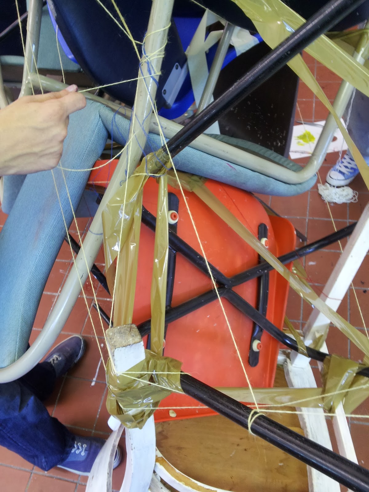
This class was an introduction to building shapes into a sculpture then carrying it over to paper.Many mediums and methods were used such as chalk, acrylic, foil, string, tape, sponges forks and many more.
To be honest it wasn't the most exciting start to college, maybe because a lot of practices were outside of my comfort zone, but i understand the principles as to why we were learning these techniques.
Four weeks of college have arrived and i am steadily seeing why we are encouraged to explore different art techniques, my personal style has reflected my practices in college and i couldn't be happier with the result.
Below are photos of the session.


To be honest it wasn't the most exciting start to college, maybe because a lot of practices were outside of my comfort zone, but i understand the principles as to why we were learning these techniques.
Four weeks of college have arrived and i am steadily seeing why we are encouraged to explore different art techniques, my personal style has reflected my practices in college and i couldn't be happier with the result.
Below are photos of the session.



Saturday, 28 September 2013
Life Drawing Sketch
This week was followed up on proportion, I am happy with the result and so is my life drawing tutor, i just need to focus my efforts more on fitting the entire life model on paper.
 |
| chalk pencil and putty rubber |
please leave tell me what you think by leaving your comments below
Artist Assessment 3
Painter Leonid Afremov
Leonid Afremov is a professional artist widely known for his unique and colorful oil paintings, he paints mainly landscape, city scenes and seascapes. Born in Belarus, he attended art school in from which he graduated as an elite member. Afremov believes that art helps us to be free from aggression and depression, his work is evidence to that as he creates his work from his positive attitude.From what i h have analyzed Afremov's work displays elements of texture, contrast, shape and color in his work. Afremov sampled many methods of painting but found the palette knife was his preferred tool for creating his oil paintings.

 |
| Leonid Afremov Copyright |
When i saw Afremov's work my thoughts were warmth and positivity, the choice of his colors aroused those feelings. The images i selected portray Love, travel, seasons and nostalgia. I say this because in one image you see a couple huddled arm in arm beneath an umbrella, which projects these visuals. The other image displays the city of Verona in Italy, did Afremov paint this piece while on a boat in Italy and holds this experience as nostalgia.
Afremov states that "Each of his artworks reflect his feelings, sensitivity, passion, and the music from my soul" I myself can agree.
More of Leonid Afremovs work
Friday, 27 September 2013
Life Drawing Class Update
This was done two weeks ago in which the tutor gave us our first lesson in preportion.
It went well!!
 |
| pencil with shades of chalk |


Artist Assessment 2
Photographer Boogie
Boogie is a photographer who was born and raised in Belgrade, Serbia. He started out documenting the civil war which destroyed his country in the 1990's. He moved to Brooklyn New York in 1998 where he published 5 monographs depicting the underbelly of different countries around the world. His most notable work was 2006 "ITS ALL GOOD" which showcased the street life of his residence in Brooklyn. I believe Boogies work relates to his past in Serbia, as it displays struggle, sufferance and rebellion.
My first response to his work is that he is telling a story, the two images that i selected show the reality of the projects in Brooklyn. How i feel about his work is a mix of grief and worry as the photography relates to a few of my family members.
My first response to his work is that he is telling a story, the two images that i selected show the reality of the projects in Brooklyn. How i feel about his work is a mix of grief and worry as the photography relates to a few of my family members.
 |
| Boogie Copyright |
 |

in which his work showcases colour and black and white shots that correspond with the style of shoe.
All in all boogie still continues to depict reality through his work.
Photography Class:Closeups and angle shots
Set One
The photos I have presented are the first 2 weeks of college.The work is all based around identity and I worked in a group to produce these works. I have quite a few photos so there will be more posts to follow.


Thursday, 26 September 2013
Blogging About Blogs
A Blog That Fits
I had my first lesson of photography a few weeks back which was pretty cool it consisted of covering the elements of taking a good quality photo. While in class we were encouraged to set up a blog to record our work, which is how my blogger account exists now.
Our tutor Natalie stressed the importance having a blog that's fits you and what it communicates to the reader. I have had some experience blogging so i understand certain criteria such as the blog name, spacing, backdrop and font colour.
We have been given the assignment to cover five artist blogs writing our personal opinions on what was good and bad about it.
Here are my thoughts.
Mike Giant
This blog is by illustrator Mike Giant, one of big my influences.This blog is draped in a black back drop that compliments the bold white Arial font he is using. Links have a good placement and images are crisp. His written content stands out as it is informative, fun and has great depth. This blog has no error that i can see,except some people not being able to read white lettering on a black background.
>>>>blog link
>>>>blog link
Velo City Girl
This blog has a nice simple white backdrop and a stylish readable font that communicates the bloggers personality.This photographer has great quality images and visible links for easy access.
The let down of this blog is the sizing of the page in the fact that you have to scroll horizontally to read the rest of a sentence, also there are a lot of advertisement links that can be distracting at times.
>>>>blog link
>>>>blog link
Girl And The Deer
Despite a some jumbled info to the left of the page the blog is very eye catching in the title and simplicity.
Not many words are expressed in this blog as the content is self explanatory.
>>>>blog link
>>>>blog link
Jovove
Very sleek blog teaming with high quality illustrations, graphics and photography.It has a bold white backdrop with a stylish pink boarder. The blogs downfall is bad scrolling navigation, font size, font colour and placement of info and links. Very cool blog though.
>>>>blog link
>>>>blog link
We Make Money Not Art
The blog title is literal in the sense as it is covered with advertisements and blog content showcasing a mixture of artists.The written content is great, but the letdown is tightly squeezed blog posts accompanied by a variation of different font colours.
Looking at what i have written is a guide in a sense. By doing research and forming opinions on other peoples blogs, we recognize the pros and cons in our own which allows us to build the blog that fits us.
>>>>blog link
>>>>blog link
Wednesday, 25 September 2013
Life Drawing Class
Life Drawing
Life drawing is one of my favourite college subjects by far, i feel at home in the fact that i as an artist have crafted my skills so sketching only feels natural. I will say some areas felt alien too, i was introduced back to the foundation of drawing e.g proportion, measurement and weight placement. I was left to question myself as an artist and how to approach my work.
So far i have had great satisfaction with the knowledge given and the work i have produced from it, here are a collection of my life drawings done 3 weeks ago ( later updates will be more in line with the week i had lessons)
 |
| Depth created with chalk line and blending |
 |
| Chalk and pencil |
 |
| Focusing on weight placement |
 |
| Left Handed with chalk |
 |
Subscribe to:
Posts (Atom)